Thursday, August 30, 2012

More School layouts

More pictures of the interior of the old School for Creative and Perfoming Arts building.  Another exquisite Rookwood Water Fountain.  The Woodward High School sign and an old vending machine in the hall all laid out on Creative Memories All Star Paper and some sticker buttons.

This layout using black cardstock, music sheet vellum and Reflections (Michael's line) 3D music stickers.  Old, old bold Creative Memories sticker letters.  I have been using all numbers for my titles lately to use up the numbers in my alphabet stickers.  I also used Tim Holtz paper tape.  All based on a white Creative Memories page.

 Here I used an overlay and added some black bling to dress it up.  More vellum, paper tape and Reflections stickers.

Reminisce Travel Addition Layout used for School

The scan and stitch program I used to scan my 12x12 pages in isn't perfect and can be seen here where my border does not look straight.  I assure you it is!  I made this border with the Reminisce Cricut cartridge, Reminisce paper and metallic gold paper for the shadow.  It really accents the gold in the Reminisce Travel Addition paper.  I used Reminisce solid paper and the rotary trimmer with scallop blade to create a pocket on the bottom half of the page.

 The subject matter is Logan's school, the School for Creative and Perfoming Arts.  This is the old building.  Obviously old, look at the Rookwood Water Fountains.  I researched and found that this building has a number of various Rookwood Fountains that were a gift to the school when it was Woodward High School earlier in the twentieth centtury.  This old building will be missed.  I used the Reminisce Cricut Cartridge to make the letters out of the metallic gold I used for the shadow of the border, another piece is on the page.


Wednesday, August 29, 2012

Discover Rock Grunge Layout

I used the Discover Rock Grunge Addition from Creative Memories to create an awesome boy layout!  I used all the pieces from the additon including papers, mats and stickers. I pulled the journal box out of the grunge/diva album accents.  I used Sassy Mandrian Letters and the titletopia tool to create the Title across both pages.  The title is a Jethro Tull song which I thought appropriate for ice skating on Fountain Square and Rock Grunge paper and stickers.


Monday, August 27, 2012

Holidazzle Layouts

This is not the first time I used Holidazzle for my nieces.  These colors are Hana's favorite!  Her room is even pink and green!


Sunday, August 26, 2012

Two and Half Page Layout: class for Lebanon Crop & Shop til you Drop!!

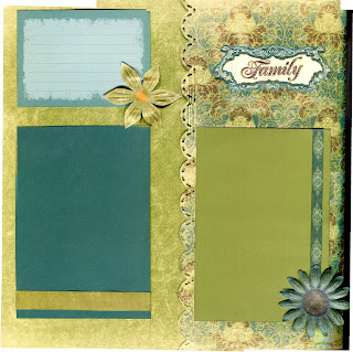
Finally!  I haven't been able to upload pictures to blogger for days!  I have scanned so much the last few days of my latest 2010 album.  But first and foremost this is my class for Lebanon Shop & Crop til you Drop!  October 13, 2012 more info is at www.scrapbookcropandshop.blogspot.com.  This layout uses Creative Memories Reminisce Power Palette to create a two and half page layout!  I have used two 12x12 papers and a 6.25" piece of paper.  In this class we will use the Creative Memories Border Maker System, here I have used the Scalloped cartridge to edge my "half page".  In this class, we will also be inking the edges with the Creative Memories Croptoberfest exclusive chalking inks!  I also "fussy" cut the bird to include the beauty of the paper on page 1.  The class also includes mats, journal boxes, frame, sticker titles, paper ribbon and paper flowers all from the Reminisce Power Palette.  Participants will have their choice of class kit which may vary from the pages shown.  The cost of this class is $15.

The page and a half page....

Inside of "half page".

Monday, August 13, 2012

Mixed Media 12x12 using Graphic 45

I have so many close friends who are Leo's.  Sheila's birthday was last friday and this is what I made for her.  I started with a picture taken by her friend Eric at the Southgate House, most likely at the Witches Ball.  It just screamed for this Graphic 45 Alice in Wonderland Halloween paper!  I also bought this at Stampaway in 2011.  This is the first time I have used it.  I keep stuff around a while.  However, the red flower is new, I purchased it and the Prima Pebble in the center at Tuesday Morning.  I used Tim Holtz vials and metal spider glued on with the Ultimate!  Crafters Pick, again.  The gold letters also just came from Tuesday Morning.  The tag in the upper left is also Graphic 45 from the back of the paper stack.  The ribbon across the bottom came from some liquor or chocolate in the past year or so.  I used a craft knife to fussy cut the keyhole to expose Sheila's picture.  I also inserted a Hobby Lobby brand spinner with a red sparkle brad.  There are also a couple of bling flowers that also recently came from Tuesday Morning.  The frame came (without glass) from Michael's with a page already in it, and since this is so 3-D, I couldn't have the glass. To give it all a another layer, I place some netting from my ribbon box over the top but catty-corner as to leave the spinner exposed to play with, but I have it pointing to the catapillar.

Sunday, August 12, 2012

Mixed media Clayboard Project

I made this project for my friend Debbi's birthday today!  I have been working on it for a while.  First step was to paint the box, many coats of peach, copper and pearl.  I took a class at Stampaway in 2011 where I learned this technique.  The clayboard was a material I knew nothing about until this class.  It is found in the artist section at Michael's.  It comes in white and black I believe.  The hopeful artist that I am stocked up on the materials for these babies right after the class and over a year later has finally finished my first one!!  So the clayboard looks really nice colored with chalk inks as I have done here.  I also purchased some clayboard inks which I believe will produce more vivid colors, but I have not tried them yet.  You apply the chalk inks and immediately wipe away to soften the colors and blend.  You can stamp on clayboard like I have done here with Staz-on ink.  I used timber brown and the dark green on this project.  The beauty of the clayboard is how it can be etched to expose the white core.  I used an awl to etch and highlight the stamped images.  The column came from Stampaway 2011.  The lady stamp was purchased used at The Stamping Cottage in Bellevue, a wonderful new and used stamp store.  The leaf stamp is SEI.

I used some found objects on the inside.  The metal part of the sun was literally found on the sidewalk a few doors down.  I found four of them, don't know what they were from but they are awesome!  The feathers were found at the Forecastle Festival I recently attended in Louisville, KY.  The lion was from my bead stash.  I only had one, I don't know where it came from.  The bottles are new from the Hobby Lobby line that copies the Tim Holtz stuff.  The have the amber colored ones, Tim's collection does not.  I filled the amber one with sage I collected years ago when I moved back from Seattle.  All the "flowers/leafs"  had fallen off the stems, so it was easy to collect  in the vial.  Still cleansing I am sure.  The other is a little blingy glitter-magic for Debbi!  I filled the sun with a little paper to complete it.  There is also magic mesh inside the box and on top for the grassy garden.

I used a Prima Pebble on the front of the box.

I used a textured paper around foam for the "garden" box.  Tacky tape wouldn't hold the ends, so I stuck some brads in there.  The flowers are from years ago, a purchase from Big Lots.  Most of this was put together with The Ultimate!  Crafters Pick glue found at Michael's and suggested by the teacher of this class to get the best adhesion to the clayboard.  I found it really to be the Ultimate! and glue an entire table full of broken objects I had lying around my studio.  It dries pretty fast, I had to hold an awkward project for a few minutes and clear and the excess wipes clean.  Great product!

I used Moonlight Smooch to highlight the latch and the crystal on top.

Friday, August 10, 2012

Creative Memories Memory Manager 4.0!!!

http://youtu.be/1UFl-l1_0wg

The upgrade is so awesome!  I cannot even wait for the disc, I am going to download it as soon as it is available (September 1, 2012?!)

Thursday, August 9, 2012

another rusted sun layout

This is another old layout, the first time I used the Fancy Pants Rusted Sun line.  I loved the bright colors and flowers with the tie dye and scenic pics of Nelson Ledges Quarry near Toledo, OH.

Wednesday, August 8, 2012

you are my sunshine traditional layout


Here is the traditional page I made with the same pictures I used in the Be Young digital layout.  I made this one a few years ago.  I used patterned Creative Memories paper in the old 10x12 size.  I freehanded the sun and clouds.

Sunday, August 5, 2012

Creative Memories Sunshine and Rainbows Digital Kit


Here I started with a predesigned page from Click n Fill III, I used the Creative Memories digital kit Sunshine and Rainbows.  I added the text in Lucida handwriting.  I love the sunshine image!

Friday, August 3, 2012

Creative Memories Be Young Boy Digital Addition


With this layout I started with a click and fill predesigned page.  I picked out several 4 picture templates but chose this one because of the angular ribbons reminded me of the pictures themselves.  Logan is my number one subject matter!  I used all Be Young Boy Digital Addition pieces from Creative Memories.

Creative Memories Rugged Digital Layout

I used a pre-designed page and the Creative Memories Rugged Digital Power Palette for the great layout of my son from the Cincinnati Zoo many moons ago.

Thursday, August 2, 2012

More Key West Layouts

Here I used the Fancy Pants Rusted Sun line.  On this first page I used a full page overlay with flocked "waves"  I put some of the pictures on top and some underneath.  I put the journal box on with a surfboard brad from the same line.  I used the CM tearing tool to tear one sheet of the paper to use on both pages.

The same paper reversed.  I matted with  red bazzil cardstock and the blue and yellow are old CM cardstock.  I cut out a surfboard from the paper and popped it up with pop dots and used a surfboard rubon.  The title is a rubon on the red bazzil cardstock.  I completed 24 pages of Logan's trip to Key West in July 2010 with my dad this past  weekend. I didn'tjournal much, I am waiting for Logan to return from his visit with granddad this summer to help me with it.